Website redesign: clearer layout, easier navigation, better content, and much more!
13 Apr 2018
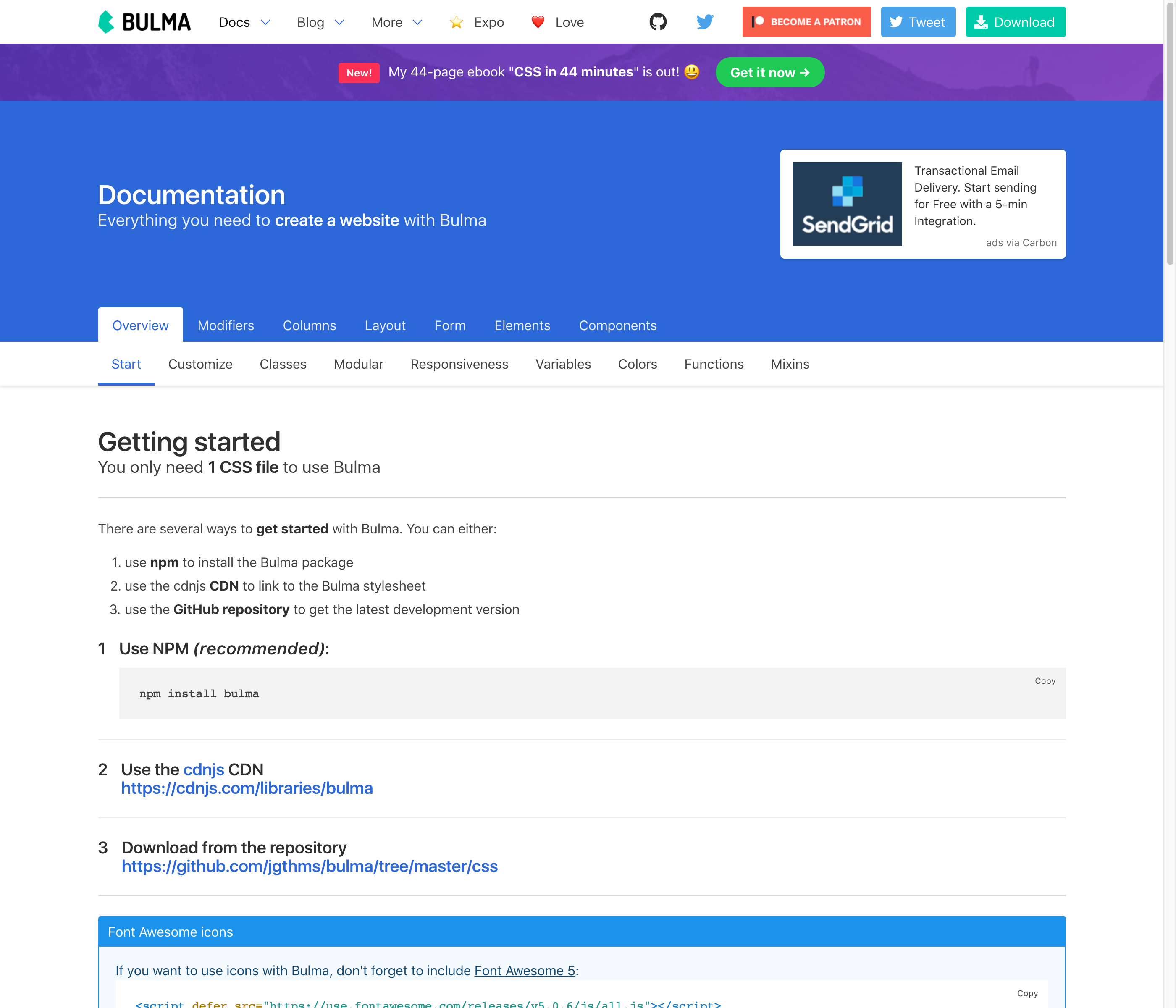
The Bulma website has been widely redesigned!
Navbar #
The navbar has been updated with a ligther markup and cleaner design:

This doesn’t affect the current navbars. There’s actually a new modifier called is-spaced that was created for this new navbar. Documentation coming soon!
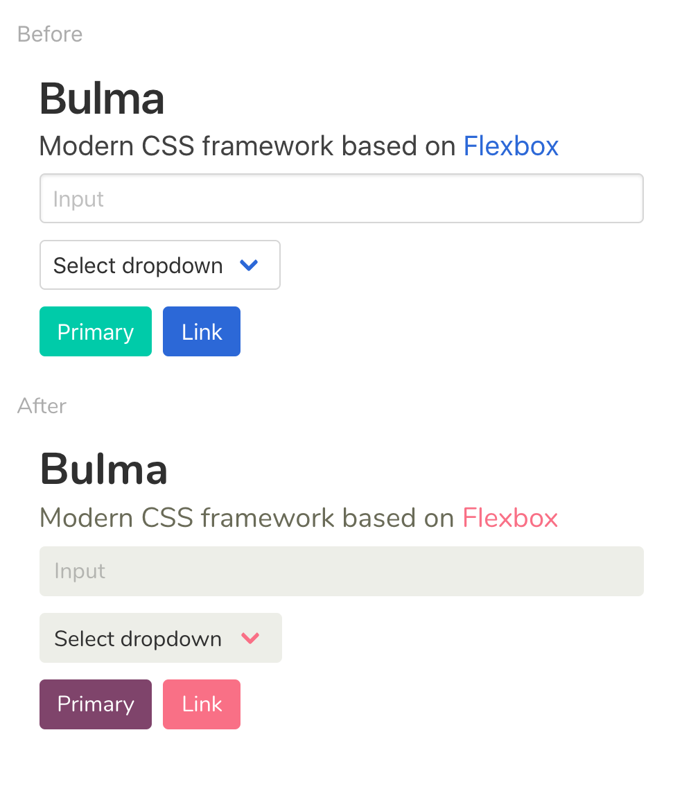
Customize example #
On the homepage, there’s a new customization section with a live example:
Breadcrumb #

A breadcrumb is not visible at the top of each page, to easily navigate up and down the hierarchy.
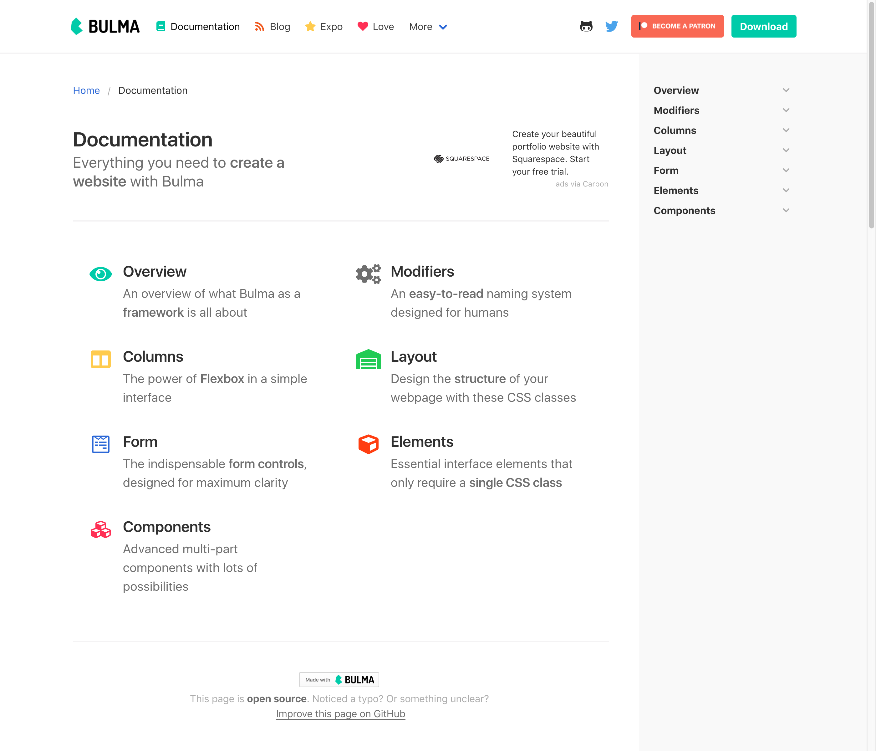
This has led to the creation of new intermediate pages:
- documentation
- documentation/modifiers
- documentation/columns
- documentation/layout
- documentation/form
- documentation/elements
- documentation/components
- more
Links #
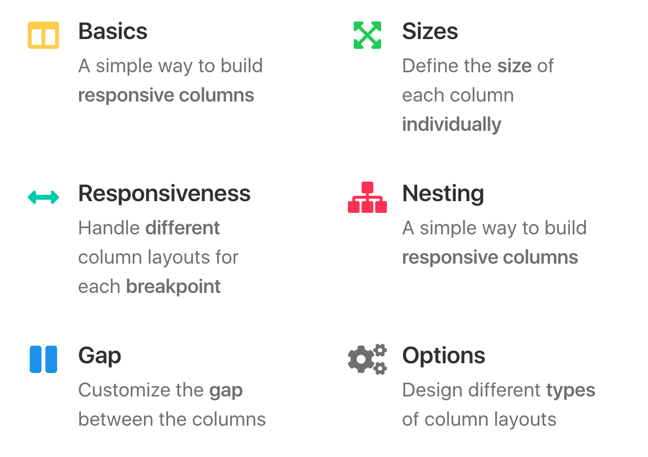
These intermediate pages have new link boxes that help dive into each sub-category:
Previous/Next #
Next to the breadcrumb, you can easily navigate to the sibling pages with the previous and next links:

These links are also available at the bottom:

Categories #
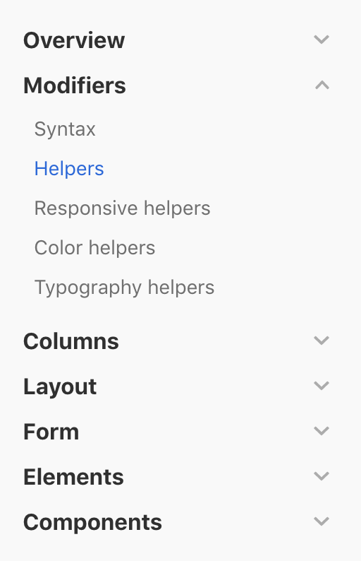
There’s a new sidebar including a navigation menu with all the categories and sub-categories:
Scroll spy #
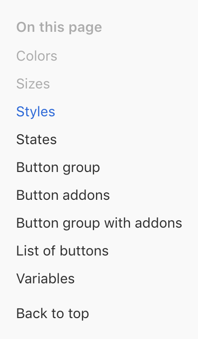
On some pages below the categories, you’ll find a new menu called “On this page” which is actually a scroll spy:
Footer #
The footer has been redesigned as well. Among other things, there’s a sitemap available:

Code #
The Bulma website is built with Jekyll. In the process of this redesign, the underlying code that helps maintain this website has been optimized and cleaned up as well.
This well help further updates to be easier.
