Because images can take a few seconds to load (or not at all), use the .image container to specify a precisely sized container so that your layout isn't broken because of image loading or image errors.
Images
A container for responsive images
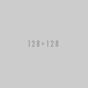
<figure class="image is-128x128">
  <img src="https://versions.bulma.io/0.6.1/images/placeholders/128x128.png">
</figure>
Fixed square images #
There are 7 dimensions to choose from, useful for avatars:
image is-16x16 |
 |
16x16px |
image is-24x24 |
 |
24x24px |
image is-32x32 |
 |
32x32px |
image is-48x48 |
 |
48x48px |
image is-64x64 |
 |
64x64px |
image is-96x96 |
 |
96x96px |
image is-128x128 |
|
128x128px |
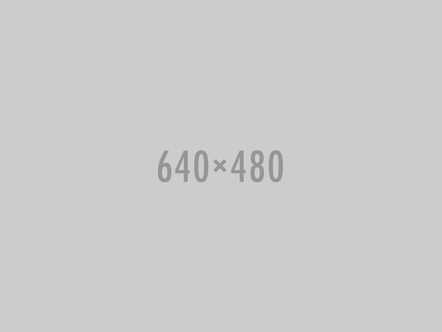
Retina images #
Because the image is fixed in size, you can use an image that is twice as big. So for example, in a 128x128 container, you can use a 256x256 image, but resized to 128x128 pixels.

<figure class="image is-128x128">
<img src="https://versions.bulma.io/0.6.1/images/placeholders/256x256.png">
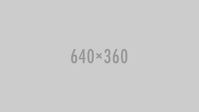
</figure>Responsive images with ratios #
If you don't know the exact dimensions but know the ratio instead, you can use one of the 5 ratio modifiers:
image is-square |
 |
Square (or 1by1) |
image is-1by1 |
|
1 by 1 |
image is-4by3 |
 |
4 by 3 |
image is-3by2 |
 |
3 by 2 |
image is-16by9 |
 |
16 by 9 |
image is-2by1 |
 |
2 by 1 |
The .image container will take up the whole width while maintaining the perfect ratio.
Variables #
You can use these variables to customize this element. Simply set one or multiple of these variables before importing Bulma. Learn how.
| Name | Default value |
|---|---|
| Name | Default value |
$dimensions
|
16 24 32 48 64 96 128
|